SVG is vector outlined artwork, not editable text. Do not retype the logo.
Previews show the cropped artwork. Individual PNG/SVG links open the original hosted exports. All original lowercase alternatives are in the logo collection ZIP. For the full production collection, use the Google Drive folder above. Folder names refer to the destination background, not the lettering colour.
Space to breathe
¼ width
Keep a clear perimeter
Leave at least one quarter of the displayed mark width on every side. Keep text, edges and busy art outside that space.
Actual size matters
32 px Minimum48 px Preferred96 px More room
Use less at smaller sizes
Use the mark alone for small avatars. Test the final circular crop without cutting the A or wing. Favicons are a special small-size exception.
✓ Do
Use the supplied artwork without altering its shapes
Choose light lettering on dark surfaces, dark lettering on light surfaces
Use original PNGs for raster delivery
Keep a static, readable identity beside decorative motion
× Avoid
Stretching, cutting into artwork, tracing or recolouring the logo
Adding glow, shadows, outlines or extra effects to the mark
Placing the logo over visually busy artwork
Assuming every SVG is infinitely scalable
Before print, embroidery, engraving or large signage
The supplied mark is raster-based even inside its SVG container. Lockups combine that mark with vector wordmark paths. Ask for a suitable approved production master for one-colour printing, embroidery, cut vinyl or engraving. Confirm effective resolution, colour, bleed/trim, substrate and finishing with the actual supplier, then approve a physical proof. This guide does not define universal CMYK, Pantone, bleed or manufacturing specifications.
Three distinct roles. A strong headline, a brief expressive phrase and body text that stays out of the reader’s way.
01 / Urbanist 700 · Headings
Your ambition. Built with AI.
Hero 44–78 px · 1.05 line height Section 34–54 px · 1.12 line height Keep statements short.
02 / Instrument Serif 400 italic · Accent
A human touch
A short hero phrase only. Not the everyday section font. Never an entire paragraph.
03 / Inter 400–700 · Body & UI
Practical technology, built around people.
Body 16–18 px · 1.65–1.75 line height Controls 14–16 px Keep essential text live and selectable.
These are website reference scales. Adapt to the actual viewing distance for slides and print. The page self-hosts the licensed font files; their SIL Open Font License notices are included in the download.
05 / Imagery & icons
Give the image a clear job.
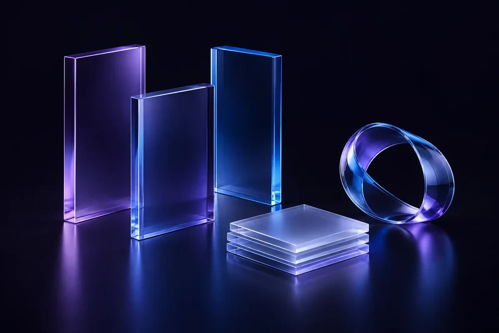
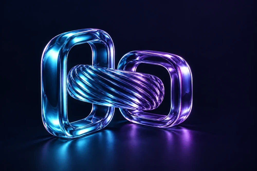
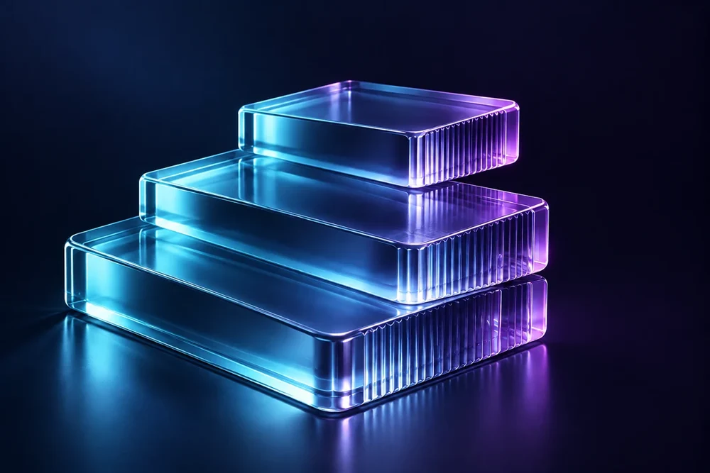
Blue-purple glass, precise edges and generous negative space. Use atmosphere for brand expression; use real screens and real evidence to explain actual work.
Use sculptural artwork for covers, dividers and atmosphere. Keep the main message as live text beside the art or on a stable, quiet surface.
Proof of work
Use genuine screenshots and approved customer evidence when describing a product. Decorative or generated scenes are illustrations, not photos of actual offices, people or client outcomes.
↗
Simple, useful icons
White line glyphs at 20–24 px, in a 44 px tile with 13 px radius. Label unfamiliar actions. Keep icons secondary to the task.
06 / Interface & spacing
Make room for what matters.
A steady rhythm keeps layouts related. Clear hierarchy keeps the reader moving.
1240px maximum content width
40 / 20px desktop / mobile gutters
24 / 15px card / button radius
4
8
12
16
24
32
48
64
88
One main message
Put the task, audience and useful next action first. Do not make readers wait for a transition to understand the page.
Quiet reading surfaces
Use light surfaces for long business documents and stable dark surfaces for focused web content. Keep body text off busy art.
Designed for real use
Check dates, links and instructions on a phone, at meeting-room size and in the destination crop. Make focus and controls easy to see.
07 / Identity & voice
Capable. Never complicated.
AI Empower is practical, people-first technology. Speak with clarity and useful specifics. Start with the person’s need.
“Your ambition. Built with AI.”
Sound like this
“Tell us what is slowing your team down. We’ll explore a useful next step together.”
Use “AI Empower” in prose. The period belongs to the display treatment, not the company name.
Keep claims grounded
Describe a concrete task or show an actual example. Avoid guaranteed savings, invented growth numbers, fake clients, awards or certifications.
Only publish outcomes when their baseline, sample, date and source are established and approved.
Confirmation details, access links and requested resources should appear before large decoration. Essential meaning must survive blocked images.
Layout example
Resource delivery
Your resource is ready
Lead with what the person requested and explain the next step in one clear sentence.
Resource action
Illustrative layout only. Replace with the real resource and a verified link.
Build for inboxes
600–640 px canvas; 28–36 px desktop gutters
Table layout and inline essential styling
Arial / Helvetica fallback for broad support
Hosted PNG logos, JPEG artwork, explicit image sizes and useful alt text
Absolute HTTPS links and a text fallback for access actions
Check real received messages in the intended clients, including mobile, dark mode and blocked images. The presence of a template does not mean a sender, permission or unsubscribe workflow is configured.
Use cubic-bezier(0.23, 1, 0.32, 1). Honour reduced-motion preferences, provide pause controls for ongoing animation and keep a static lockup nearby when a rotating mark turns away. This guide has no autoplay animation.
10 / Downloads
Fewer choices. Better starting points.
Use the existing hosted originals or the lightweight references below. The full production collection is available through Google Drive; this page does not duplicate the large archives.
Original logo collection
Original PNG and SVG families, hosted on aiempower.ca. The full production collection is available through the Google Drive links above.
The original packaged guide is dated 13 September 2026; the public download panel is dated 17 September 2026. This page’s usage edition is 1 October 2026. Those dates describe different releases.
Spacing, minimum sizes and examples are recommended usage guidance from the official source. Channel-specific preflight guidance here makes those rules easier to apply. Use these assets to represent AI Empower accurately. For co-branding or other uses, contact info@aiempower.ca. This guide does not create a new asset licence.
Before you publish
Check facts and permission, remove placeholders, test links, confirm dates and time zones, review the real crop, and check contrast and legibility at the final size. Keep source files distinct from rendered exports. For print, obtain the supplier’s proof.